Testing and Deployment
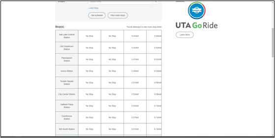
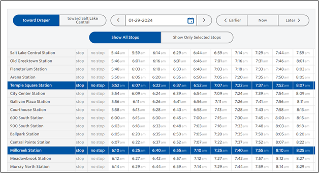
Guru Technologies published this new page live alongside the existing one for testing and comparing. This also allowed Guru and UTA to conveniently get feedback from friends and family outside the core teams involved. They tested heavily within various browsers and devices. Once everything was ready, Guru published to the traditional URL.
Results
UTA received positive feedback from users about this new and improved schedule page. UTA reported their customer service complaints in this area decreased by 60% because of the work that had been done to improve the user experience. Transit systems from other states have reached out to Guru to do similar treatments to their schedule pages as well.
UTA and Guru Technologies continue to partner for schedule page maintenance and upkeep to keep UTA’s new and improved system running smoothly. Ultimately, the collaboration successfully transformed a point of frustration into a tool of empowerment for UTA riders, streamlining their journeys and boosting satisfaction.

